WPF - skinning the ComboBox moving the DropDown Menu around
A couple of days ago a friend of mine asked for some help in skinning a WPF ComboBox control, he had a special need in which the dropdown menu items list of the control had to be aligned to the right side of the ComboBox and had to expand in the left direction (instead of the usual visual appearance, which has the opposite behavior: it is anchored to the left side of the control and expands to the right).
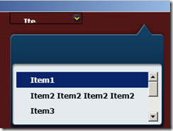
I asked him to build a very simple test project containing the control and its current skin and pass it to me, this is a picture of what he obtained at that time.
I have to admit I’m not a very good designer nor a graphic expert so I got the basic control template extracting it using Blend and I looked at it, here is a snippet of the original XAML from the template:
<ControlTemplate TargetType="{x:Type ComboBox}">
	<Grid x:Name="MainGrid" SnapsToDevicePixels="true">
		<Grid.ColumnDefinitions>
			<ColumnDefinition Width="*"/>
			<ColumnDefinition MinWidth="{DynamicResource {x:Static SystemParameters.VerticalScrollBarWidthKey}}" Width="0"/>
		</Grid.ColumnDefinitions>
		<Popup x:Name="PART_Popup" AllowsTransparency="true" Grid.ColumnSpan="2" IsOpen="{Binding IsDropDownOpen, RelativeSource={RelativeSource TemplatedParent}}" Margin="1" PopupAnimation="{DynamicResource {x:Static SystemParameters.ComboBoxPopupAnimationKey}}" Placement="Bottom">
			<Microsoft_Windows_Themes:SystemDropShadowChrome x:Name="Shdw" Color="Transparent" MaxHeight="{TemplateBinding MaxDropDownHeight}" MinWidth="{Binding ActualWidth, ElementName=MainGrid}">
				<Border x:Name="DropDownBorder" BorderBrush="{DynamicResource {x:Static SystemColors.WindowFrameBrushKey}}" BorderThickness="1" Background="{DynamicResource {x:Static SystemColors.WindowBrushKey}}">
					<ScrollViewer CanContentScroll="true">
						<ItemsPresenter KeyboardNavigation.DirectionalNavigation="Contained" SnapsToDevicePixels="{TemplateBinding SnapsToDevicePixels}"/>
					</ScrollViewer>
				</Border>
			</Microsoft_Windows_Themes:SystemDropShadowChrome>
		</Popup>
		<ToggleButton BorderBrush="{TemplateBinding BorderBrush}" Background="{TemplateBinding Background}" Grid.ColumnSpan="2" IsChecked="{Binding IsDropDownOpen, Mode=TwoWay, RelativeSource={RelativeSource TemplatedParent}}" Style="{StaticResource ComboBoxReadonlyToggleButton2}"/>
		<ContentPresenter ContentTemplate="{TemplateBinding SelectionBoxItemTemplate}" ContentTemplateSelector="{TemplateBinding ItemTemplateSelector}" Content="{TemplateBinding SelectionBoxItem}" ContentStringFormat="{TemplateBinding SelectionBoxItemStringFormat}" HorizontalAlignment="{TemplateBinding HorizontalContentAlignment}" IsHitTestVisible="false" Margin="{TemplateBinding Padding}" SnapsToDevicePixels="{TemplateBinding SnapsToDevicePixels}" VerticalAlignment="{TemplateBinding VerticalContentAlignment}"/>
	</Grid>
	<ControlTemplate.Triggers>
		<Trigger Property="HasDropShadow" SourceName="PART_Popup" Value="true">
			<Setter Property="Margin" TargetName="Shdw" Value="0,0,5,5"/>
			<Setter Property="Color" TargetName="Shdw" Value="#71000000"/>
		</Trigger>
		<Trigger Property="HasItems" Value="false">
			<Setter Property="Height" TargetName="DropDownBorder" Value="95"/>
		</Trigger>
		<Trigger Property="IsEnabled" Value="false">
			<Setter Property="Foreground" Value="{DynamicResource {x:Static SystemColors.GrayTextBrushKey}}"/>
			<Setter Property="Background" Value="#FFF4F4F4"/>
		</Trigger>
		<Trigger Property="IsGrouping" Value="true">
			<Setter Property="ScrollViewer.CanContentScroll" Value="false"/>
		</Trigger>
	</ControlTemplate.Triggers>
</ControlTemplate>

