Sometimes you want to define a consistent look for all you application and maybe you completely replace the template of a control (lets say...a button :D), then you want to use the same template with small variations (colors or images for example).
Lets say we have realized the usual round button with a gradient background and that you want to use different colors which have different meanings for the interface, the same principles apply to any other control or custom controls.
Actually you can do it all just defining styles in the App.xaml file, like this:
        <RadialGradientBrush x:Name="RedRadialBrush" GradientOrigin="0.2,0.2" >
            <GradientStop Color="#FFFFFFFF"/>
            <GradientStop Color="Red"  Offset="1"/>
        </RadialGradientBrush>

        <Style x:Key="RoundTextButton" TargetType="Button">
            <Setter Property="Background" Value="{StaticResource GrayRadialBrush}" />
            <Setter Property="Width" Value="30" />
            <Setter Property="Height" Value="30" />
            <Setter Property="FontSize" Value="10" />

            <Setter Property="Template">
                <Setter.Value>
                    <ControlTemplate TargetType="Button">
                        <Grid Width="{TemplateBinding Width}" Height="{TemplateBinding Height}">
                            <vsm:VisualStateManager.VisualStateGroups>
                                <vsm:VisualStateGroup x:Name="FocusStates">
                                    <vsm:VisualState x:Name="Unfocused"/>
                                    ...
        </Style>
and you can instantiate some on a page like this:
<Grid x:Name="LayoutRoot" Background="White">
        <StackPanel>
            <StackPanel Orientation="Horizontal">
                <Button Content="Edit1" Style="{StaticResource RoundTextButton}" />
                <Button Content="Edit2" Style="{StaticResource RoundTextButton}" Background="{StaticResource YellowRadialBrush}" />
                <Button Content="Edit3" Style="{StaticResource RoundTextButton}" Background="{StaticResource GreenRadialBrush}" />
                <Button Content="Edit4" Style="{StaticResource RoundTextButton}" Background="{StaticResource RedRadialBrush}" />
            </StackPanel>
            ...
        </StackPanel>
    </Grid>
The code above produce this:
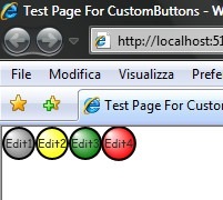
4 small round buttons with animations when your mause move over them or when you press them.
What we see here is that the xaml code of the page looks a little bloated and not very well readable, plus changing a single resource as the background color of the buttons in code is a little messy cause you have to create a new brush consistent with the previous ones.
What we can do is define our own Button control (which inherits from Button), define the properties we want to access directly (as dependancy properties to support binding and templating) and then move the master template in the Generic.xaml file. The button class is straightforward and doesn't need many comments:
public class CustomButton : Button, INotifyPropertyChanged
    {
        public CustomButton() : base()
        {
            this.DefaultStyleKey = typeof(CustomButton);
        }

        public override void OnApplyTemplate()
        {
            base.OnApplyTemplate();

            GradientStop gs = GetTemplateChild("EllipseBackGroundColor") as GradientStop;
            if (gs != null)
                gs.Color = BackgroundColor;
        }

        #region BackgroundColor

        /// <summary>
        /// Gets or sets the BackgroundColor possible Value of the Color object.
        /// </summary>
        public Color BackgroundColor
        {
            get { return (Color)GetValue(BackgroundColorProperty); }
            set { SetValue(BackgroundColorProperty, value); }
        }

        /// <summary>
        /// Identifies the BackgroundColor dependency property.
        /// </summary>
        public static readonly DependencyProperty BackgroundColorProperty =
                        DependencyProperty.Register(
                                "BackgroundColor",
                                typeof(Color),
                                typeof(CustomButton),
                                new PropertyMetadata(OnBackgroundColorPropertyChanged));

        /// <summary>
        /// BackgroundColorProperty property changed handler.
        /// </summary>
        /// <param name="d">CustomButton that changed its BackgroundColor.</param>
        /// <param name="e">DependencyPropertyChangedEventArgs.</param>
        private static void OnBackgroundColorPropertyChanged(DependencyObject d, DependencyPropertyChangedEventArgs e)
        {
            CustomButton _CustomButton = d as CustomButton;
            if (_CustomButton != null)
            {
                OnPropertyChanged(_CustomButton, "BackgroundColor");
            }
        }
        #endregion BackgroundColor

        #region INotifyPropertyChanged Members
    }
The DefaultStyleKey propery setted in the constructor tells what is the default style to load from the Generic.xaml file.
The interesting thing happens in the OnApplyTemplate() functions; here since we cannot use TemplateBinding to change the color of the GradientStop used in the RadialBrush that defines the background color of the button, we have to access to the element in code and change its value 'at runtime'.
I modified my xaml like this:
<Grid x:Name="LayoutRoot" Background="White">
        <StackPanel>
            <StackPanel Orientation="Horizontal">
                <Button Content="Edit1" Style="{StaticResource RoundTextButton}" />
                <Button Content="Edit2" Style="{StaticResource RoundTextButton}" Background="{StaticResource YellowRadialBrush}" />
                <Button Content="Edit3" Style="{StaticResource RoundTextButton}" Background="{StaticResource GreenRadialBrush}" />
                <Button Content="Edit4" Style="{StaticResource RoundTextButton}" Background="{StaticResource RedRadialBrush}" />
            </StackPanel>
            <StackPanel Orientation="Horizontal">
                <ctrl:CustomButton Content="Edit1" />
                <ctrl:CustomButton Content="Edit1" BackgroundColor="Yellow" />
                <ctrl:CustomButton Content="Edit1" BackgroundColor="Green" />
                <ctrl:CustomButton Content="Edit1" BackgroundColor="Red" />
            </StackPanel>
        </StackPanel>
    </Grid>
But this isnt enough yet since the first time I run the code I saw that the buttons weren't working well:
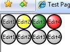
The 4 buttons were rendered circular but their color was not right and the animation didnt worked too...it tooks me a while (and the help of SilverlightDefaultStyleBrowser) to realize that by default every control is created in a DISABLED state and that you have to enable it (in the xaml style or in code).
<Style TargetType="ctrl:CustomButton">
        <!-- key lines to enable the control -->
        <Setter Property="IsEnabled" Value="true" />
        <Setter Property="IsTabStop" Value="true" />
...
After placing the right lines in the default style in Generic.xaml it all finally worked and you can now have your buttons working with a more compact and readable xaml.
Example Solution:
Related Content
- Silverlight: simulate a 'Windows' desktop application - part 1 (26/08/2015)
- Silverlight: The Power of (26/08/2015)
- Silverlight: How to Add a Context Menù to a FrameworkElement (26/08/2015)
- Silverlight: Dropdown Menu Control (10/07/2008)
- Silverlight: how to build a simple Menu Control (26/08/2015)
- More related document (46)