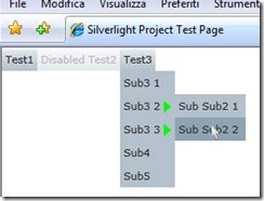
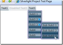
In a previous post I showed how we can build a simple menu control for Silverlight 2 Beta 2 (Silverlight: how to build a simple menu control); then with the release of Silverlight RC0 some things were changed and the menu stopped working, due to how events are handled for disabled controls (Silverlight 2 RC0 – first problems due to undocumented breaking changes on disabled controls).
The only way to overcome these problems was to completely rewrite the control, I also took advantage of this to implement some more features, such as the possibility to have nested menus and a better support for skinning through styles.
Here’s what we want to obtain:
The new dropdown menu is now composed of 4 different controls:
- MenuBar: a container for the menu, it only supports horizontal placing of elements right now.
- MenuPanel: a control that provides the frame in which the menu items are displayed (for styling purposes).
- MenuItem: the base class for a single menu item, it can contain a list of menu items (to support nested menus).
- MainMenuItem: the class that ‘describes’ a menu item that belongs to the MenuBar, it keeps a list of Menu Items.
The MenuItem control is still based on the Button control, but instead of having it placed in a xaml file alongside a grid, this time we derive the new control from the Button class. This way the control can be skinned using the standard way with templates.
The MainMenuItem derives from MenuItem and overrides some internal members.
The previous PopupProvider class was renamed MenuPopupProvider and modified to handle special cases related to the way the popup windows of chained menus are closed when the user clicks on menu items or when he moves the mouse outside the menu itself; with the current modification this class is no more a generic popup handler but it’s became specific for this menu control.
The two major changes were made to the ClosePopup() function, which now has to take into account the fact that we cannot close a menu if there’s a submenu opened and also, if the closing of the current menu is confirmed, it has to forward the closing request to the parent menu (if there’s any).
1: private void ClosePopup()
2: {
3: if (_isPopupOpen && _isPopupClosing)
4: {
5: _closeTimer.Stop();
6: //the popup logically belongs to the owner, so we have to check in one of his children have a popup opened.
7: if (_owner is MenuItem)
8: {
9: MenuItem mi = _owner as MenuItem;
10: if (mi.HasSubItems)
11: foreach (MenuItem m in mi.MenuItems)
12: if (m.IsSubMenuOpen)
13: {
14: //if so we cancel the closing request
15: _isPopupClosing = false;
16: return;
17: }
18: }
19:
20: _isPopupOpen = _isPopupClosing = _popup.IsOpen = false;
21:
22: //if this is a menuitem and his parent is not null, we have to ask it to close its menu too,
23: //however we have to close the parent menu only if the mouse is not over the menu itself
24: if (_owner.GetType() == typeof(MenuItem))
25: {
26: MenuItem parent = (_owner as MenuItem).ParentMenuItem;
27: if (parent != null)
28: parent.CloseMenuPopup();
29: }
30: }
31: }
We also added an event handler for the MouseEnter() event on the _trigger control to open a submenu when the user hovers the parent item with the mouse.
The most interesting thing is however how we deal with the disabled controls, if a menu item is disabled it will not fire any mouse event (as it should be), but with the RC0 release it seems that when we move the mouse over a disabled control we also go outside the scope of his parent/container too... let me explain: the menu items are contained in a StackPanel, if we move the mouse over a disabled control inside the StackPanel we also get a MouseLeave() event from the StackPanel too..and this caused the PopupProvider to close the menu (see my previous posts on the subject).
To overcome this situation we have to keep the control alive (enabled) and we have to do some magic to ‘fool’ the user and let him see a disabled control, we put our ‘Magician Hat’ on and we write some code to create a Custom Visual State Manager, that we inject in the control template:
1: public class MenuVisualStateManager : VisualStateManager
2: {
3: protected override bool GoToStateCore(Control control, FrameworkElement templateRoot, string stateName, VisualStateGroup group, VisualState state, bool useTransitions)
4: {
5: MenuItem mi = (MenuItem)control;
6: if (mi.IsEnabled == false)
7: {
8: //force the control to have a disabled appearence
9: stateName = "Disabled";
10: if (group != null)
11: for (int i = 0; i < group.States.Count; i++)
12: if ((group.States[i] is VisualState) && (((VisualState)(group.States[i])).Name == stateName))
13: state = group.States[i] as VisualState;
14: }
15: if (state != null)
16: return base.GoToStateCore(control, templateRoot, stateName, group, state, useTransitions);
17: else
18: return true;
19: }
20: }
What it does is quite simple: every time the control tries to change state, our MenuVisualStateManager gets called and we have a chance to modify the next state that will be displayed: if the MenuItem related is disabled we force the VSM to display the ‘Disabled’ visual state of the button; the trick works cause the appearance of the control is completely disjoint from its operational status.
We assign the custom visual state manager in the xaml that defines the default template for the menu in the Generic.xaml file:
1: <Style TargetType="ctrl:MenuItem">
2: <Setter Property="IsEnabled" Value="true"/>
3: ...
4: <Setter Property="Template">
5: <Setter.Value>
6: <ControlTemplate TargetType="ctrl:MenuItem">
7: <Grid x:Name="MenuItemLayout">
8: <Grid.Resources>
9: ...
10: </Grid.Resources>
11: <vsm:VisualStateManager.CustomVisualStateManager>
12: <ctrl:MenuVisualStateManager x:Name="vsm" />
13: </vsm:VisualStateManager.CustomVisualStateManager>
14: <vsm:VisualStateManager.VisualStateGroups>
15: ...
The last thing to do is to override the default behavior of the IsEnabled property:
1: public new bool IsEnabled
2: {
3: get { return _isEnabled; }
4: set
5: {
6: _isEnabled = value;
7: ForceVisualState(value);
8: //this is not strictly needed if the menu control is implemented as a button and we can
9: //'really' disable the control, cause if the control is disabled no event will be fired
10: if (value)
11: EnablePopupProvider();
12: else
13: DisablePopupProvider();
14: }
15: }
16: private bool _isEnabled = true;
At this time you can use the new Dropdown Menu Control adding menu items in code only, with something like this:
1: //Dynamically buildup a menu
2: MainMenuItem m1 = Menu.AddMenu("Test1");
3: m1.AddSubmenu("Sub1");
4: m1.AddSubmenu("Long Sub1 string");
5: MenuItem sb1 = Menu.CreateMenuItem("Disabled Sub1");
6: sb1.IsEnabled = false;
7: m1.AddSubmenu(sb1);
8: sb1 = Menu.CreateMenuItem("Click Me! Sub1");
9: sb1.MenuClick += new MenuClickEventHandler(sb1_MenuClick);
10: m1.AddSubmenu(sb1);
11:
12: MainMenuItem m2 = Menu.CreateMainMenuItem("Disabled Test2");
13: m2.IsEnabled = false;
14: m2.AddSubmenu(Menu.CreateMenuItem("Sub2 1"));
15: m2.AddSubmenu(Menu.CreateMenuItem("Sub2 2"));
16: m2.AddSubmenu(Menu.CreateMenuItem("Sub2 3"));
17: Menu.AddMenu(m2);
18: ...
You can override the default template for PanelMenus, MainMenuItems and MenuItems using the PanelMenuStyle, MainMenuItemStyle and MenuItemStyle properties exposed by the MenuBar control:
1: <StackPanel x:Name="LayoutRoot" Background="White">
2: <ctrl:MenuBar x:Name="Menu"
3: MenuItemStyle="{StaticResource mi}"
4: MenuPanelStyle="{StaticResource miPanel}"></ctrl:MenuBar>
5: </StackPanel>
I’m not a professional graphic designer so my templates are actually quite questionable, in the demo solution you can find a couple of pages that show you how to use and skin this control with different graphic templates.
As usual this is a starting point for further work and a lot of improvements can be made (I’m thinking to completely remove the button control as base class and implement it from scratch, add support for icons and some cool animations, also I’m working on keyboard navigation of the menu itself).
There are also some fix to make to improve the templates assignment to each control, actually you need to use the factory methods provided by the MenuBar control to have templates correctly assigned to each MenuItem.
The solution still contains the old menu control code for you to check for changes made.
Note: I believe there are still some bugs in the way the Popup control interacts with the normal event flow, you can see this when you open a submenu window: if you keep moving the mouse over another menu item at the same level you will notice that the status of the control is not changed and the hover effect is not applied.
(thanks to Giuseppe Polverini for reviewing my English)
Example Solution:
Related Content
- Silverlight: how to build a simple Menu Control (26/08/2015)
- Silverlight: How to Add a Context Menù to a FrameworkElement (26/08/2015)
- Silverlight: simulate a 'Windows' desktop application - part 1 (26/08/2015)
- Silverlight 2 RC0 – first problems due to undocumented breaking changes on disabled controls (26/08/2015)
- Silverlight: Custom Buttons with Templates (09/01/2008)
- More related document (42)


